Usually, tax brackets are presented in tabular form. These are the rates for 2020: Lots of sites list these rates, but it’s difficult for me to trust them much without a citation. All they list for the top few DuckDuckGo results is “Source: Internal Revenue Service.” Maybe this is an SEO thing? Maybe it’s paranoid of me to doubt popular internet sites. Anyway, I got these numbers from the IRS, too.
Income Tax Brackets for Single Taxpayers in 2020
| Income Greater Than | And Income Less Than | Tax Rate |
|---|---|---|
| 0 | 9,875 | 10% |
| 9,875 | 40,125 | 12% |
| 40,125 | 85,525 | 22% |
| 85,525 | 163,300 | 24% |
| 163,300 | 207,350 | 32% |
| 207,350 | 518,400 | 35% |
| 518,400 | ♾ | 37% |
Income Tax Brackets for Married Taxpayers Filing Jointly in 2020
| Income Greater Than | And Income Less Than | Tax Rate |
|---|---|---|
| 0 | 19,750 | 10% |
| 19,750 | 80,250 | 12% |
| 80,250 | 171,050 | 22% |
| 171,050 | 326,600 | 24% |
| 326,600 | 414,700 | 32% |
| 414,700 | 622,050 | 35% |
| 622,050 | ♾ | 37% |
The main thing that stands out to me about the 2020 tax brackets is the almost-doubling of the tax rate from 12% to 22%. It’s also interesting that the dollar amount where this rate takes effect for married couples is double the dollar amount for single taxpayers. The other rate boundaries do not generally have this quality. Married rates are more favorable for most taxpayers, but the boundary for the top rate punishes marriage if both members of the couple receive outrageous compensation. Unfortanately we have a complicated tax code, but I imagine such a couple (where each partner is paid $500K) may file separately to avoid the 37% rate. I admit to getting confused by an article published by TurboTax. Given their interest in taxpayers not taking too much agency in doing their own taxes, I worry that it’s deliberate. From their site: “The standard deduction for separate filers is far lower than that offered to joint filers. In 2019, married filing separately taxpayers only receive a standard deduction of $12,200 compared to the $24,400 offered to those who filed jointly.” Isn’t this a result of filing two returns, though? Wouldn’t each return benefit from the standard deduction, making these equivalent?
In this post I’m interested in exploring some other representations of these data. Here’s the graph of the the marginal tax rate. This is the most straightforward translation of those tables into a graph.
I can think of two reasonable ways to graph these two tax policies: the first is by graphing the marginal rate. These are graphs of the marginal income tax rates for 2020. Blue represents single filers, and the red line is married, filing jointly. These colors are used for the rest of the post. I should have legends on these graphs, but I’m not sure how much more time I’ll be putting into this set of tools. If they work out in the long run I will come back and put legends on the R-generated graphs, and axis-labels on the Haskell-generated graphs in this post.
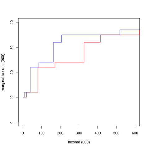
This is not useful for a tax payer trying to find their tax obligation, but this illustrates a common misconception about tax brackets. Obviously, the big jump around $40,000 for single filers is significant, and it’s easy for a naive reader to see this graph and think they are looking at their “effective” tax rate on the y-axis.
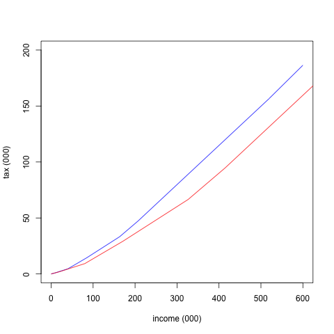
In reality, they’re looking at their marginal rate on the y-axis, the rate that applies to the next dollar they make, and they need to calculate the area under the line to the left of their income if they want to find their total tax obligation. I’ve heard college graduates express concern about staying in a lower tax bracket, and I think this is because of confusion about a graph like that one. It is much more useful if we graph the total tax obligation, rather than just the marginal rate. The marginal rate now gives the slope of the graph at any given point:
The difference between the slopes are more difficult to discern, but this feels like a more useful representation than the first one.
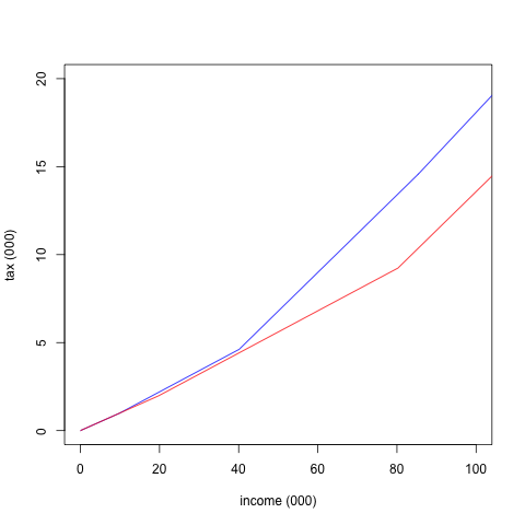
I wasn’t sure how much to zoom in on these, but you get the idea.
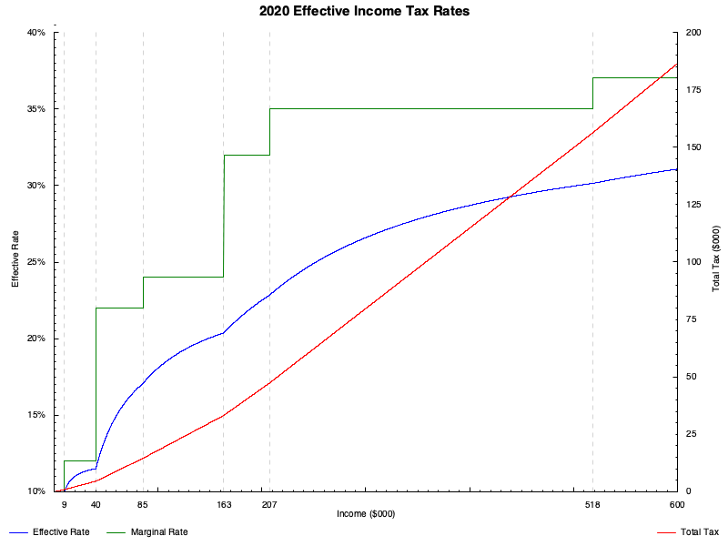
There is one more graph I’d like to try out, which is that of the effective tax rate. “Effective” here means “the tax rate you’re actually paying.” For the flat tax, the effective rate is the same as the marginal rate, because the marginal rate never changes. The term effective is ambiguous and depends on context for more complicated tax policies. I’ll graph the income divided by taxes paid to get a picture of what people actually end up paying. Here is that graph (though I only graphed it for people filing singly). I’ve overlaid the total tax paid on the right axis, and graphed the marginal and effective rates on the left axis. This graph looks different from the others, because I used Haskell to make it. I have an upcoming post about some of the difficulties I’ve had picking up R for these sorts of tasks. After spending much of the day yesterday trying to make this graph, I turned to Haskell and had an easier time. Hopefully, I have not given up on experimenting with R, but I can get much more done with Haskell most of the time. Maybe I’ll return to this task with it: I would like to better understand the paradigm before I decide I’m through with it.
I’ll be exploring different tax regimes more in a future post, but this all I have for now on income tax brackets.